
2020 Interior Design Trends for Kitchens
Interior design trends change from year to year, sometimes suddenly, but usually, there are gradual changes in popular opinion that can be predicted. In this blog, we’re going to be considering the upcoming interior designs that will keep your home looking fresh for the new decade.
Tranquil Dawn and Classic Blue
Dulux and Pantone have announced the colours of 2020 as shades of teal and blue named Tranquil Dawn and Classic Blue. Every year, there is a lot of speculation about what the meaning behind the two paint companies’ choice of colours might mean, and this year the consensus is that these calm and soothing shades have been chosen in response to feelings of discontent and anxiety.
Dulux and Pantone choose their Colour of the Year based on thorough research on key influencers in design, but whatever everyone’s reasons are for leaning towards melancholic blues and tranquil greens, there are plenty of exciting new trends to shape your home around.
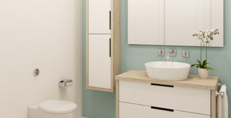
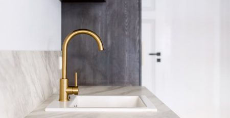
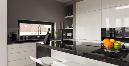
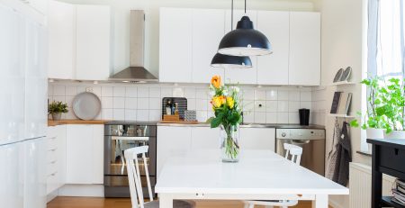
Two-tone Kitchens
Luckily for everyone who renovated their kitchen last year, two-tone pieces and rooms are still very much at the forefront of interior design policies. Two-tone kitchens display a satisfying mix of careful organisation and blending with bold and exciting decisions.
In comparison to those kitchens which are designed around using a variety of shades of the same colour, two-tone kitchens positively pop with style. If you want to create a stylish two-tone kitchen in 2020, we recommend using one or both of 2020’s colours of the year.
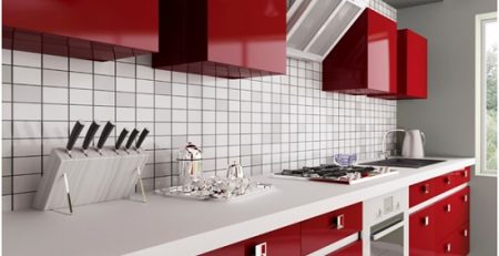
Two-tone Surprises
We loved two-tone so much in 2019 that the two-tone trend has escaped the boundaries of the kitchen and possessed kitchen cabinets, bookcases and wardrobes. The idea is to upcycle your current furnishings with a modern lick of paint by painting the outside a contrasting colour to the interior.
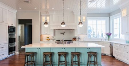
Creating a Great Two-Tone Environment
If you’re struggling to decide which colours are going to look best in a two-tone environment, we have some handy tips to help you understand how different colours can complement one another. The easiest method for creating a two-tone kitchen is to rely on shades of black and white as these shades will definitely complement one another. Whether or not your kitchen appears bold or calming in black and white shades depends on the amount of contrast between the shades. For example, black against white is quite a stark contrast, whereas two dissimilar shades of grey will create a much softer, more natural kitchen aesthetic.
Understanding how colour depth can affect the image in blacks and whites lays the groundwork for understanding how to fill your kitchen with colours to create the look that you want. For example, picture a two-tone kitchen in pastel colours, then picture it again with the same colours, but more saturated, richer, bolder shades. The kitchen with the bolder colours is more overpowering than the one which uses pastel shades, but the one that makes you happiest will depend on personal preference. Recent years have favoured rich, jewel tones, so if you’re looking to stay on trend you may favour bold kitchen colours in blue and green.
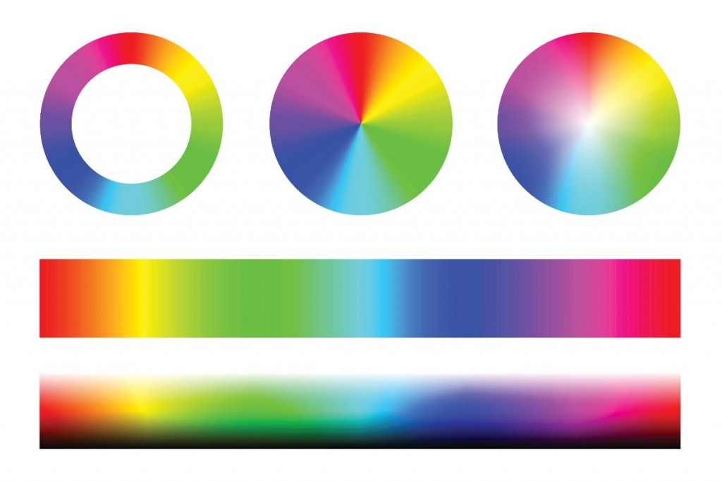
An easy way to understand which seemingly contrasting colours complement each other is to use a colour wheel. Generally, opposing colours on the wheel will look good together, and those designing a two-tone kitchen will typically put the heaviest colour (moodiest/darkest) colour on the bottom half of the kitchen.
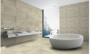
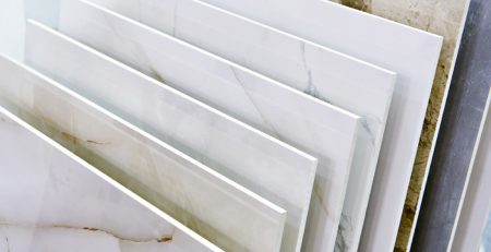
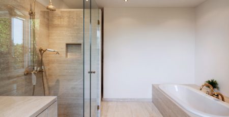
How to Use Tiles in Two-Tone Rooms
Using the right tiles in a two-tone room can bring everything together. In a kitchen where bold colours are the main focus of the room, an accent colour can bring harmony between two contesting colours. One way to bring this accent colour into your kitchen is through your choice of appliances and surface tops, but another way is through your tiles.
Alternatively, you may feel that your kitchen would not benefit from adding an accent colour, so an unobtrusive tiling decision could be more beneficial for your interior design. Our range of Grespania Kitchen tiles includes a range of designs, shapes and colours to ensure that you’ll be able to find the perfect tiles to complement your designs.
Other Interior Design Trends for 2020
Colours aren’t the be-all-and-end-all of interior design, important though they are. Biophilia continues to be an important theme in modern homes, so if you’re considering setting a New Year’s resolution based on getting a bit green-fingered, you’ll be glad to know that you’re on the right track in terms of trends! The growing desire for biophilic designs may also be fuelling Dulux’s decision to declare the colour of 2020 as a shade of green to complement any indoor plants and suggest sustainability.
At the other end of the spectrum, some homes are benefitting from engaging in themes that have more in common with science-fiction than mother nature. Geometric patterns are still in, so you can rest easy knowing that your quirky geometric illusion feature wall is still super trendy.

Leave a Reply